Leafs App Redesign
I redesigned the Leafs mobile app to make it simple and easier to use.
Problem
The Maple Leafs mobile app has become a means through which fans can connect with their favourite team. However, our team realized that user satisfaction and retention was decreasing. After sifting through feedback and reviews we identified one major problem. The app was confusing to navigate through. Fans didn’t know where to go to find what they were looking for.
User Research
The goal of conducting user interviews is to understand how fans categorize, group, and navigate to meaningful features in the app that they care about.
I conducted 3 activities with fans to achieve this goal.
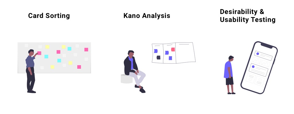
Card Sorting
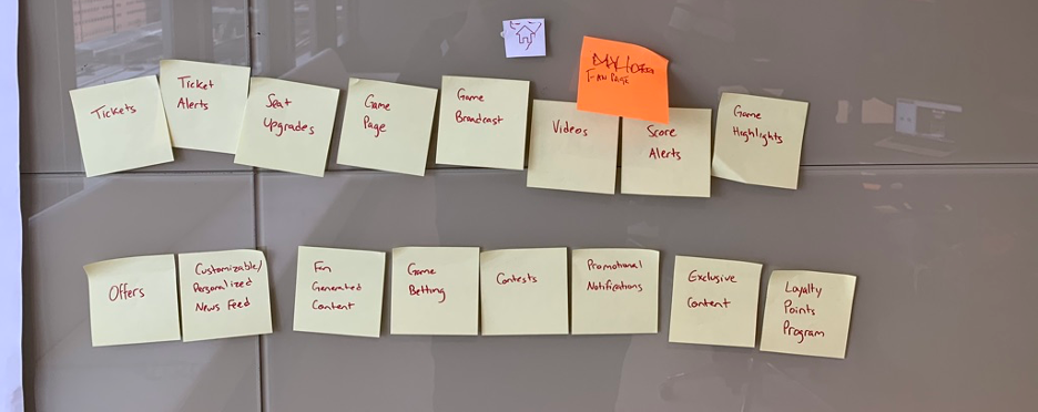
Fans were given cards with a list of current/future features in the app and asked to sort them into groups. Once the groupings were completed, they were asked to name each group and assign an appropriate icon from a list provided to them.
Kano Analysis
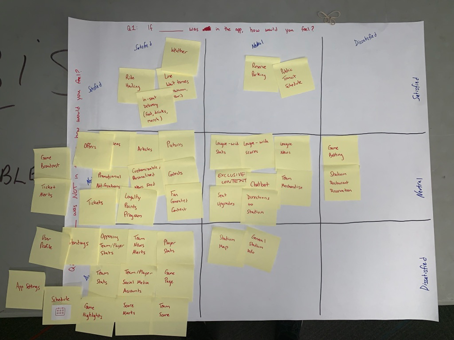
Fans are asked to place each feature on a Kano table. The Kano table asks the user “If *feature* was in the app, how would you feel?” and “If *feature* was NOT in the app, how would you feel? This evaluation helps us determine how important a particular feature is.
Desirability and Usability Testing
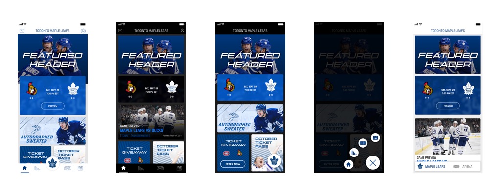
Fans were presented with 4 app concepts with different visual treatments. Each concept utilized a different navigation model. Fans were asked to provide 3 vowels to describe each of the concepts to assess its’ UI desirability. Next they were asked to fill out a system usability scale (SUS) questionnaire to assess the navigation models.
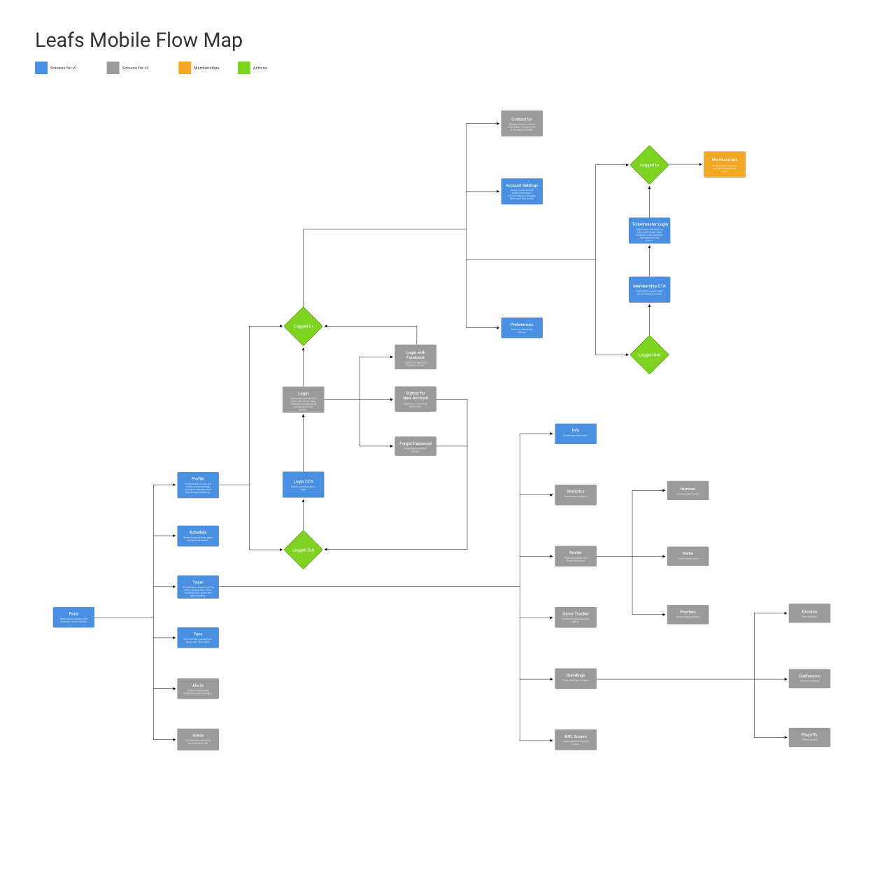
User Flow Map
After analyzing results from the user research sessions we learned:
1. How to group content within the app.
2. Which features users felt were important.
3. The 2nd navigation model had the highest usability scores.
4. The desirable visual treatment for UI.
These results were used to build the user flow. The user flow map also breaks down features into different versions.
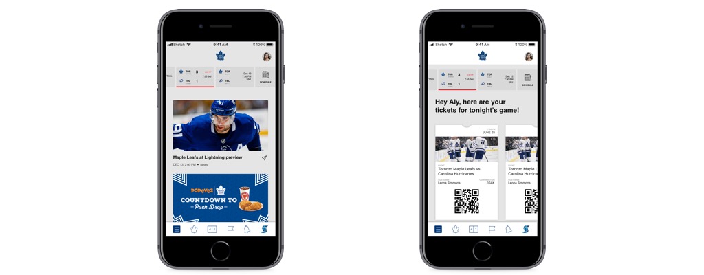
Medium-Fidelity Designs
I leveraged the user flow map to build medium-fidelity designs in order to validate we were headed in the right direction. We put these designs in front of some users for some quick guerrilla usability testing. I learned that the new information hierarchy was a massive improvement but there were visual aspects that needed to be tweaked (eg. tab icons & naming).
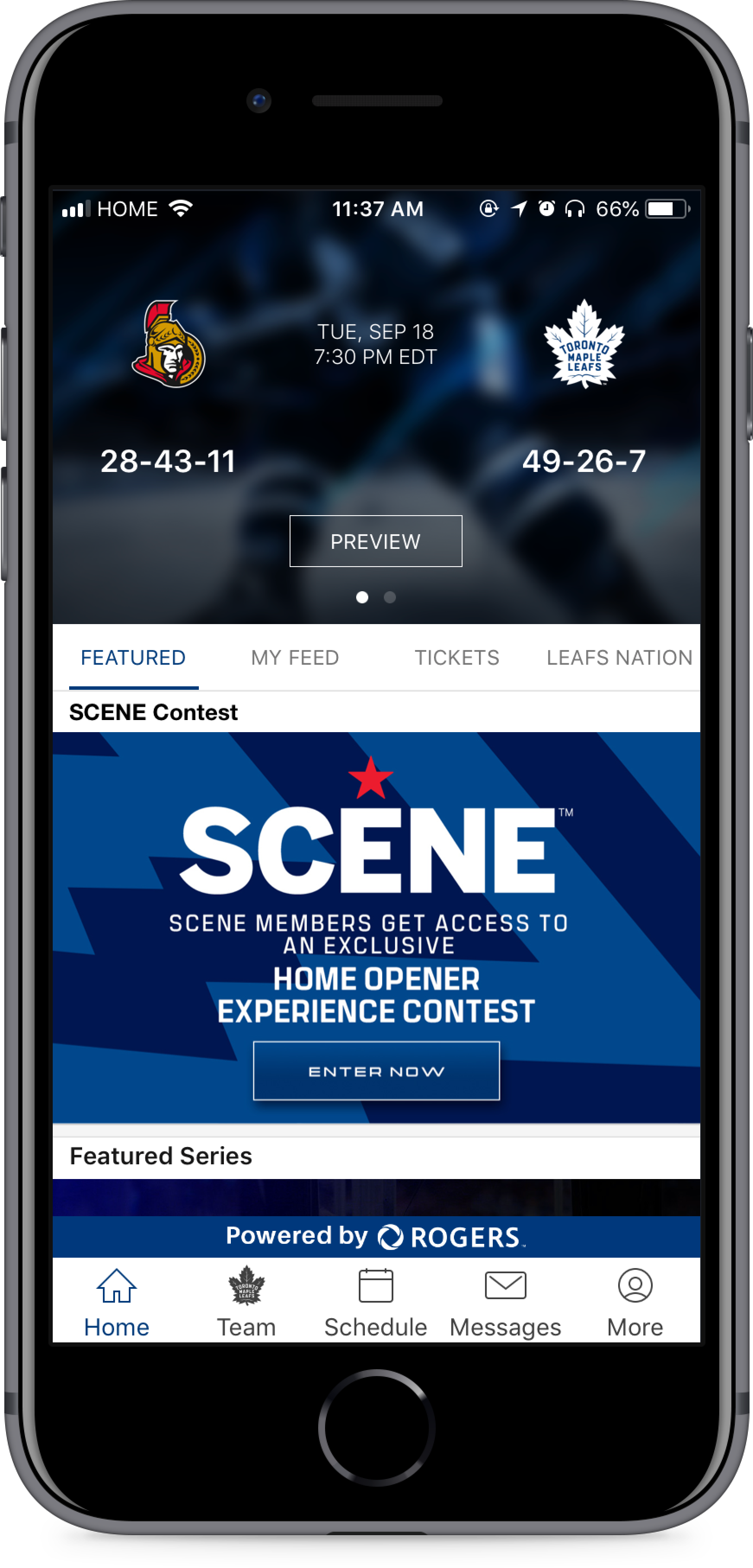
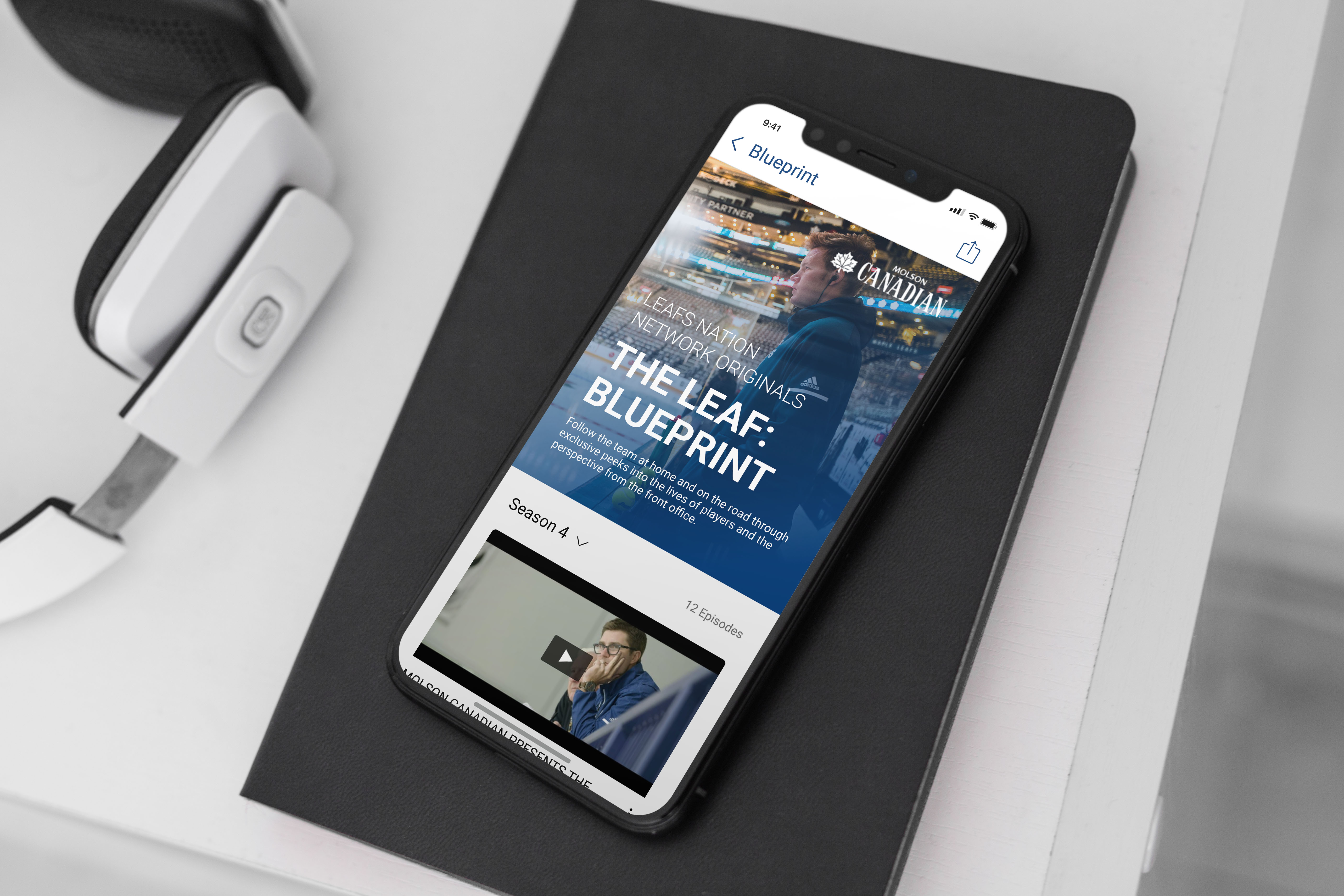
High-Fidelity Designs
I completed high-fidelity designs for the Maple Leafs app and broke it down into feasible versions to hand-off to engineering. Features such as personalized feeds and integrated ticketing features would be higher effort and would therefore need more time to build.
CLICK HERE TO VIEW THE FULL HIGH-FIDELITY MOCKUPS.
Results
We saw immediate results in the month following the release. iOS app store ratings went from 3.4 stars to 4.5 stars. Play store ratings went from 3.8 to 4.2. Qualitative feedback also improved; “simple” and “easy to use” were commonly used terms.
The redesign also helped internal departments understand where to place certain content. Prior to the redesign, marketing teams would place content in various places within the app. A dedicated space for their content made their lives easier.
All other team apps (Toronto Raptors, Toronto FC, Toronto Argonauts) moved to the newly designed architecture due to the success of the redesign.